
The Answer in Plain English
Responsive web design is the approach of building a website that automatically adjusts its layout, images, and content to display correctly on any screen — whether that’s a desktop monitor, a laptop, a tablet, or a smartphone.
It still matters in 2026 because most people searching for local services in Ottawa are doing it on a phone. If your website doesn’t work properly on mobile — text too small to read, buttons too close to tap, content that requires horizontal scrolling — you are losing visitors, losing conversions, and ranking lower on Google.
Responsive design is not a trend. It is the current standard for how professional websites are built, and it directly affects how many calls, quote requests, and inquiries your website generates.
This guide explains what responsive web design is, how it works, why it affects your Google rankings, and how to test whether your current site meets 2026 standards.
What Is Responsive Web Design?
Responsive web design is a method of building websites using flexible layouts, flexible images, and CSS rules (called media queries) that allow the site to detect the screen size it is being viewed on and automatically adjust how it displays.
Think of it this way: a responsive website behaves like water. Pour water into a glass, a bottle, or a bowl and it takes the shape of the container. A responsive website does the same — it takes the shape of whatever screen it is being viewed on, without losing any content or requiring the user to zoom in and scroll sideways to read it.
The three core technical ingredients of responsive design:
Flexible grids — Instead of building a layout with fixed pixel widths (a column that is always 600 pixels wide, for example), responsive design uses proportional units — percentages — so that columns resize relative to the screen they are on.
Flexible images — Images are coded to scale within their container rather than overflowing or requiring horizontal scrolling on smaller screens.
CSS media queries — These are rules written into the website’s stylesheet that say, in effect: “If the screen is smaller than 768 pixels wide, switch to a single-column layout and increase the font size.” Media queries allow a single website to behave differently on different devices without requiring a separate mobile site.
What responsive design is not:
Responsive design is not a separate mobile website (a different URL like m.yourwebsite.com). It is not an app. It is not a plugin you bolt onto an existing site after the fact. It is a design and development approach that is applied from the beginning of a website build — or comprehensively rebuilt into an existing site.

A responsive website automatically adapts its layout to display correctly on any screen size — without requiring users to zoom, pinch, or scroll horizontally to read the content.
Why Responsive Web Design Still Matters in 2026
Every year someone asks whether responsive design is still relevant. Every year the answer becomes more emphatic: yes.
Here is why 2026 is no different:
Mobile search is now the majority of all searches. Multiple industry sources consistently report that more than 60% of Google searches happen on mobile devices. For local searches — someone looking for a plumber, a dentist, a lawyer, or a restaurant in Ottawa — the mobile share is even higher because these are exactly the kinds of searches people make while on the go.
Screen sizes are more varied than ever. In 2024 and 2025, foldable devices, large-screen tablets, and a wider range of smartphone sizes have expanded the range of screen dimensions a website must handle. A site that worked on a standard iPhone in 2018 may not work correctly on a foldable Samsung or an iPad Pro today without proper responsive coding.
User expectations have risen sharply. Ottawa customers now expect every website to work perfectly on their phone. A site that requires pinching and zooming to read is no longer seen as an inconvenience — it is seen as a sign of a business that hasn’t kept up. This directly affects whether visitors trust you enough to call.
Accessibility standards are increasing. Responsive design is foundational to web accessibility. Content that reflows correctly on small screens, text that scales without becoming unreadable, and touch targets that are large enough to tap accurately all contribute to a more accessible experience — and increasingly, accessibility is not just a best practice but an expectation.
It is easier to maintain one responsive site than two separate websites. The older alternative — a dedicated mobile site at a separate URL — requires maintaining two versions of every page, two sets of metadata, and two content update workflows. Responsive design eliminates this entirely.
How Responsive Design Helps SEO
The connection between responsive design and Google rankings is direct and officially confirmed by Google.
Mobile-first indexing. Google has used mobile-first indexing since 2020, meaning Google primarily uses the mobile version of your website to determine how it should rank. If your mobile experience is poor — content doesn’t display, pages load slowly, text is too small — Google’s evaluation of your site is based on that poor mobile experience, regardless of how well the desktop version works.
According to Google Search Central’s guidance on mobile-first indexing, sites that have identical content on mobile and desktop, proper structured data on both versions, and equivalent metadata on both versions perform best under mobile-first indexing.
Core Web Vitals and page experience. Google’s Core Web Vitals — which measure loading performance (Largest Contentful Paint), visual stability (Cumulative Layout Shift), and responsiveness (Interaction to Next Paint) — are evaluated primarily on mobile. A non-responsive site that loads slowly, causes elements to shift around as it loads, or responds sluggishly to touch inputs will score poorly on all three. These scores are confirmed ranking factors.
Lower bounce rates. When a visitor arrives on a site that is difficult to use on mobile, they leave — quickly. Google interprets this as a signal that the page did not satisfy the searcher’s intent. Consistently high bounce rates from mobile visitors suppress rankings over time. A responsive site that is genuinely usable on a phone produces lower bounce rates and longer engagement, both of which contribute positively to how Google evaluates the page.
Crawl efficiency. A single responsive URL for each page of your website is more crawl-efficient than a separate mobile site. Google’s crawlers don’t have to handle duplicate content, rel=canonical tags between mobile and desktop versions, or redirect chains. This means your crawl budget — the amount of time Google spends crawling your site — is used more effectively on a responsive site.
Responsive Design vs Mobile Website vs Mobile App
These three approaches are often confused. Here is a clear comparison:
Responsive website (recommended for most businesses) One website, one URL, one set of content. Automatically adapts to any screen size. Easiest to maintain, most Google-friendly, and what the vast majority of Ottawa small businesses should be using.
Separate mobile website (m.dot sites) A second website built specifically for mobile, usually at a URL like m.yoursite.com. Was common before responsive design became standard. Now considered outdated and creates significant SEO complexity — duplicate content, split link equity, and two sets of pages to maintain. Not recommended for new builds.
Native mobile app A downloadable application installed on a user’s device. Appropriate for businesses where the core product or service is delivered through the app (a food ordering app, a fitness tracking app). Not appropriate as a substitute for a business website — apps require users to download them before they can access your content, which eliminates discovery through Google search entirely.
Progressive Web App (PWA) A hybrid approach that builds app-like experiences within a browser. Some e-commerce businesses and media companies use PWAs. For most Ottawa small service businesses, a well-built responsive website delivers everything a PWA would without the additional complexity.
The practical answer for most Ottawa businesses: A professionally built responsive website is the right choice. It is maintainable, Google-friendly, accessible, and performs well on every device your clients might use.
What Makes a Website Truly Responsive?
“Responsive” has become a marketing term that some web designers apply loosely. Here is what genuine, well-built responsive design actually involves:
Flexible Layouts
The page structure expands and contracts smoothly across screen widths. Columns that sit side by side on desktop stack vertically on mobile. Navigation menus collapse into a hamburger menu on smaller screens. Content never overflows its container or requires horizontal scrolling.
Common mistake: Building a layout that looks correct on one or two tested screen sizes but breaks on others — particularly on the many mid-size tablet dimensions that sit between standard mobile and standard desktop.
Responsive Images
Images scale within their container rather than overflowing or loading at unnecessarily large file sizes. Well-built responsive sites also use modern image formats (WebP) and serve appropriately sized images based on the screen requesting them.
Common mistake: Uploading large desktop-resolution images without any resizing logic, causing mobile devices to download unnecessarily large files — which dramatically slows mobile loading time.
Mobile-Friendly Navigation
Navigation menus are redesigned for touch screens. Links are large enough to tap accurately with a finger (the standard minimum touch target is 44×44 pixels). Dropdown menus that rely on hover states on desktop are rebuilt for tap interactions on mobile.
Common mistake: Keeping a complex multi-level desktop navigation on mobile without adapting it. On a small screen, a ten-item navigation bar is unusable.
Readable Typography
Font sizes scale appropriately for different screen sizes. Body text on mobile should typically be no smaller than 16px. Heading sizes scale down proportionally. Line length (measure) is adjusted to remain readable — very long lines of text on a wide desktop become appropriately shorter on a phone.
Common mistake: Setting a fixed font size that is comfortable on desktop (12–13px) and leaving it unchanged for mobile, where it requires zooming to read.
Touch-Friendly Buttons and CTAs
Call to action buttons — “Get a Quote,” “Call Us,” “Book an Appointment” — are sized and spaced for accurate tapping on a touchscreen. Phone numbers are coded as tappable links that open the phone dialer directly.
Common mistake: Buttons that are large enough visually but placed too close to other clickable elements, causing unintended taps. This is particularly common with navigation links and call-to-action buttons placed near each other.
Fast Mobile Performance
A responsive website that is slow to load on mobile is not doing its job. Page speed on mobile is directly tied to conversion rates — and to Google rankings through Core Web Vitals.
Test your current site at Google PageSpeed Insights. A mobile score above 70 is a reasonable benchmark. Below 50 is a serious performance problem that affects both user experience and rankings. For a deeper look at what impacts your website’s speed and rankings, our guide on how to improve your website’s SEO covers technical performance as part of the full SEO framework.
Optimized Forms
Contact forms and quote request forms reflow correctly on mobile. Input fields are large enough to tap. The form does not require horizontal scrolling. Labels are clearly associated with their fields. On mobile, the keyboard type that appears (numeric for phone fields, email keyboard for email fields) is correctly specified.
Common mistake: Multi-column form layouts on desktop that break into an unusable mess on mobile.
Consistent User Experience Across Devices
Every page of the website is accessible and usable on every screen size. Users arriving on a service page from a Google search on their phone should find the same information, the same call to action, and the same experience as a visitor arriving on desktop.
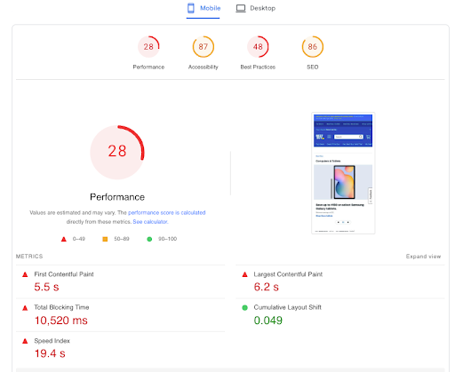
Google evaluates your website using its mobile version first. A site that performs poorly on mobile — regardless of how it looks on desktop — will rank lower in search results.
Common Responsive Design Mistakes
A non-responsive website on mobile forces users to zoom and scroll horizontally to read content — one of the most common reasons visitors leave without converting.
Even websites that were built with good intentions often have responsive design problems that are silently costing them visitors and leads:
Tiny text on mobile. Body text below 14px is difficult to read without zooming on most smartphones. The practical result is that visitors leave rather than struggling to read.
Buttons too close together. A tap on a phone is far less precise than a click with a cursor. Buttons placed within 8–10 pixels of each other cause constant mis-taps, which degrades the user experience rapidly.
Horizontal scrolling. If users have to scroll left and right to see all the content on a page, the layout is not responsive — it is broken. This is usually caused by an element with a fixed width wider than the mobile viewport.
Slow-loading images. Unoptimised, oversized images are the most common cause of poor mobile page speed scores. A hero image that is 4MB on desktop being served unchanged to a mobile device is a performance disaster.
Fixed-width layouts. Elements coded with a fixed pixel width rather than a proportional width will overflow on smaller screens.
Poor mobile navigation. Keeping a complex desktop navigation on mobile without adaptation creates an unusable experience on small screens.
Intrusive pop-ups. Google specifically penalises sites that use pop-ups or interstitials that cover the main content on mobile and are difficult to dismiss. These also create a poor user experience that drives visitors away.
Forms that are difficult to complete on mobile. If your contact form requires zooming and awkward tapping to complete, many mobile visitors will abandon it before submitting.
How to Test Whether Your Website Is Responsive
You do not need technical knowledge to test your website’s responsiveness. Here are the most reliable methods:
Test on your own phone first. Open your website on a smartphone — ideally both iOS and Android if you can. Try to complete the most important user journey on the site: read the homepage, navigate to a service page, and fill out the contact form. Note anything that requires zooming, causes frustration, or simply doesn’t work.
Resize your browser window on desktop. Open your website in Chrome or Firefox on a desktop computer and slowly drag the browser window narrower. Watch how the layout changes. If elements start overlapping, content disappears, or horizontal scroll appears at any point, those are responsive design problems.
Use browser developer tools. In Chrome, right-click anywhere on your website and select Inspect. Click the device toggle icon in the top left of the developer panel. This lets you preview your site at dozens of specific device dimensions, including iPhone, iPad, Samsung Galaxy, and more.
Run PageSpeed Insights. Go to Google PageSpeed Insights and enter your website URL. The mobile score reflects both performance and user experience signals. A score below 70 on mobile indicates issues that need addressing.
Check Google Search Console. If you have Google Search Console set up, look under Experience → Mobile Usability for any pages Google has flagged as having mobile usability issues. These are problems Google has directly identified and is factoring into how it evaluates your site.
How Much Does a Responsive Website Cost in Ottawa?
Responsive design is not a separate add-on with its own cost — it is how all professionally built websites are built today. Any web designer quoting you a non-responsive website in 2026 is either working with very outdated methods or building something that will require replacement soon.
Realistic ranges for Ottawa businesses:
| Website Type | Typical Range | What’s Included |
|---|---|---|
| Simple brochure site | $1,500 – $2,500 | 5–8 pages, responsive design, basic SEO, contact form |
| Small service business | $2,500 – $4,500 | 8–15 pages, service pages, gallery, responsive, SEO foundations |
| Professional services / trades | $3,500 – $6,000 | Multiple service pages, responsive, schema, local SEO, conversion focus |
| Custom or complex build | $6,000 – $15,000+ | E-commerce, bookings, advanced integrations, custom design |
What influences the cost within these ranges: number of pages, whether copywriting is included, whether the site needs a custom design vs a well-customised template, the level of SEO work built in, and the ongoing support arrangement.
For a full breakdown of what different budgets actually deliver, our Ottawa website cost guide covers every tier in detail.
Does Every Business Need a Responsive Website?
In 2026, the answer is effectively yes for any business that wants to be found online and generate leads from their website.
Local service businesses (contractors, plumbers, electricians, landscapers): The majority of local searches happen on mobile. A non-responsive site is nearly invisible in terms of converting mobile visitors into calls.
Professional services (law firms, accountants, consultants): Prospective clients research extensively before reaching out. A site that is difficult to use on mobile signals a lack of attention to detail — which undermines the trust professional services depend on.
Restaurants and food businesses: Almost all restaurant searches happen on phones. Menu viewing, reservation booking, and direction requests all happen on mobile. A non-responsive restaurant website loses visitors at every step.
Healthcare and wellness: Patients searching for physiotherapists, dentists, and chiropractors in Ottawa are overwhelmingly doing so on mobile. Booking access, service information, and contact options must work flawlessly on small screens.
E-commerce: Mobile commerce represents the majority of online shopping. A non-responsive e-commerce site in 2026 is not viable.
The only scenario where responsive design might be genuinely less critical is an internal business tool — an intranet, a back-office system — accessed exclusively on desktop by employees. For any public-facing business website, responsive design is non-negotiable. Our guide on what a business website should include covers the full list of elements that a professional business website needs to perform — with responsive design as the foundational layer.
The Responsive Website Checklist
Use this to evaluate your current website or assess a website you are considering having built:
Layout and display:
Website displays correctly on smartphones (tested on iOS and Android)
Website displays correctly on tablets (portrait and landscape)
No horizontal scrolling on any screen size
Columns stack vertically on mobile rather than overflowing
Images scale within their containers without distorting or overflowing
Typography and readability:
Body text is minimum 16px on mobile
Headings scale proportionally across screen sizes
Line length is comfortable to read on both mobile and desktop
Sufficient contrast between text and background
Navigation:
Mobile navigation is accessible and easy to use (hamburger menu or equivalent)
All navigation links are large enough to tap accurately
Dropdown menus work on touch screens
Calls to action and contact:
Phone number is a tappable link that opens the dialer on mobile
CTA buttons are large enough to tap (minimum 44x44px)
CTAs are spaced away from other tappable elements
Contact form works correctly on mobile without zooming
Performance:
Google PageSpeed Insights mobile score is above 70
Images are compressed and in modern formats (WebP)
No Google Search Console mobile usability errors
SEO and technical:
Same content on mobile and desktop (no mobile-stripped content)
Structured data present on mobile version
Meta descriptions and title tags present on mobile version
Frequently Asked Questions
Is my website already responsive if it was built after 2018?
Not necessarily. Most websites built after 2018 are responsive — but not all. Some template-based builds may be technically responsive at the code level while still having practical usability problems on mobile: font sizes too small, buttons too close together, or slow image loading. The only reliable way to know is to test it on an actual mobile device, run it through Google PageSpeed Insights, and check Google Search Console for mobile usability errors.
Does responsive design guarantee better Google rankings?
Responsive design is a necessary foundation for competitive Google rankings in 2026, but it does not guarantee them on its own. Google also evaluates your content quality, keyword relevance, backlinks, Core Web Vitals scores, Google Business Profile, and overall domain authority. A responsive site that loads quickly and works well on mobile is a prerequisite for ranking — not a sufficient condition by itself. For the full picture of what affects your Google rankings, our post on how to rank higher on Google Maps in Ottawa covers the local search ranking factors that work alongside your website.
Can I make my existing website responsive without rebuilding it?
It depends on how the site was built. WordPress sites built on modern themes can often be made responsive through theme updates and configuration adjustments. Sites built on heavily customised older frameworks or proprietary platforms often require a partial or complete rebuild. The honest way to assess this is to have a developer audit the current site’s code before committing to either approach. In many cases, rebuilding on a modern responsive foundation costs less in the long run than trying to retrofit responsiveness onto a rigid older build.
What is the difference between responsive design and mobile-first design?
Responsive design is the approach of building one website that adapts to all screen sizes. Mobile-first design is a philosophy within responsive design that says: design and build the mobile experience first, then expand it for larger screens. Mobile-first tends to produce better mobile performance because it starts with the constraints of the smallest screen and adds complexity for larger ones, rather than starting with a complex desktop layout and trying to compress it. Most modern professional web designers use a mobile-first approach within a responsive design framework.
How long does it take to build a responsive website?
A professionally built responsive website for an Ottawa small business typically takes four to eight weeks from kickoff to launch. This covers discovery and planning, design mockup, content integration, development, testing across devices, and final review. More complex sites — with e-commerce, custom functionality, or large service page structures — can take ten to fourteen weeks. The biggest variable is usually how quickly the client provides content and approvals, not the technical build itself.
What should I do if Google Search Console is showing mobile usability errors?
Log into Google Search Console, navigate to Experience → Mobile Usability, and review the specific errors listed. Common errors include “Text too small to read,” “Clickable elements too close together,” and “Viewport not set.” Each error includes a list of affected pages. Share this report with your web developer — these are specific, fixable issues. If the errors are widespread across many pages, it may indicate a foundational responsive design problem that requires a more comprehensive fix rather than page-by-page adjustments.
Responsive Design Is Not Optional in 2026
What is responsive web design and why does it still matter in 2026? It is the foundation of every effective business website — the approach that ensures your site works correctly for every visitor regardless of what device they’re using, and the technical layer that allows Google to properly evaluate and rank your content.
For Ottawa small businesses, this matters practically: your clients are searching on their phones. If your website doesn’t work well on a phone, you are losing those clients to competitors whose sites do. If your site is slow on mobile, Google is ranking those competitors above you.
Responsive design is not an advanced feature. It is the baseline standard. Any website built or rebuilt today should be responsive by default — and if yours isn’t, it is worth addressing before anything else.
At Ottawa Web Genius, every website we build is fully responsive, mobile-first, and tested across devices before launch. If you are not sure whether your current site meets the standard, we are happy to take a look.
Explore our web design services or view our pricing to understand what a properly built responsive website looks like — and what it takes to get your business found and converting on every device your clients use.